
Graphic Design · 2024–2025
Graphic Design
A body of identity and mark-making work for events, hackathons and community projects — exploring how a single mark stretches across colourways, grounds and contexts.
Recent identity work spanning event branding, hackathon team logos and community projects. Each mark is developed as a system — tested across colourways, grounds and lockups to ensure it holds up at any scale.
- Role
- Identity, mark design, typography
- Duration
- 2024–2025
- Tools
- Adobe Illustrator, Figma
RETHINK Event
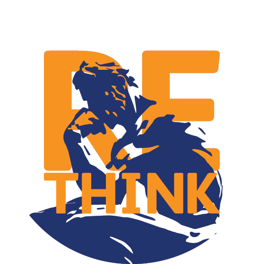
Identity for the RETHINK event series. A circular mark with concentric rings and bold typography, designed as a flexible system that performs across colourways and grounds — from a single accent colour to high-contrast lockups on black, blue or white.
PraiseDaLawd
Identity work for the PraiseDaLawd project — a confident, type-led mark presented across three signature grounds to give the brand range without losing its voice.
Hackathon 2025
A set of identity directions developed for the 2025 hackathon — including the typographic 'Fruit of the Brain Tree' route, 'Joe's Type' lettering study, the 'Balloon' concept in light and dark treatments, and a family of bulb-balloon and logoesque marks.
Hackathon 2024
Identity options developed for the 2024 hackathon — a family of playful, character-led marks rendered in a unified blue palette for a tighter, system-led feel.
EZ PeeZ — Hackathon Team Logo
Team identity for EZ PeeZ — a playful character-led mark riffing on the Manneken Pis, presented across yellow, black and two-tone colourways.
Although the logo is a bit wild, it makes sense in context, the team was formed to develop a pediatric sampling solution and the Manneken Pis seemed to be the most appropriate reference.